Help and Support » Features
Tool: Anova
****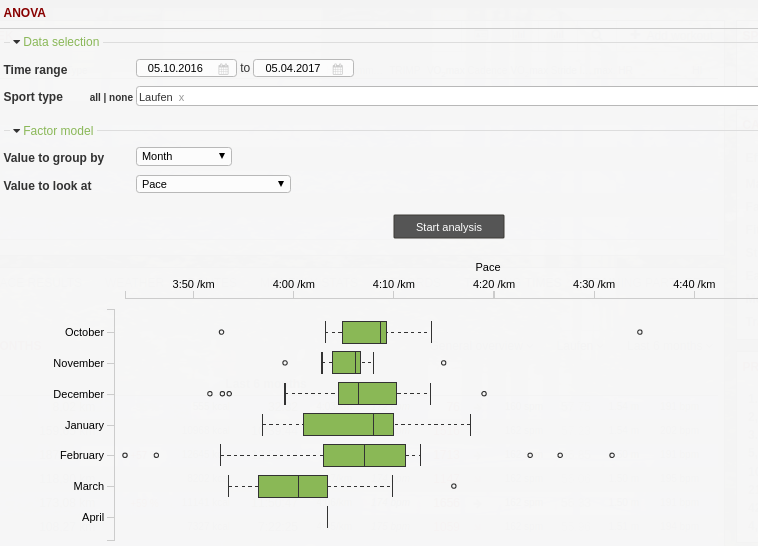
Values are visualized with so-called ‘box plots’. They give an impression of how values of a group are distributed. The middle 50% of all values are within the box itself and the so-called whiskers have a length of at most 1.5-times the interquartile range (i.e. the box’s width). Data points outside this range are called outliers.
This way of presentation allows to compare not only average values (e.g. pace over months) but deviations and outliers between different groupings. For a detailed explanation of box plots. Read more about "Box Plots" on Wikipedia.
Related articles
Didn't find an answer to your question?
Please let us know if you have wishes or have encountered bugs. We give our best to make Runalyze as good as possible for you. - Therefore we would be interested in your suggestions for improvement. In general most questions, problems and ideas are more appropriate to ask in the forum.
